 Projects / Luna
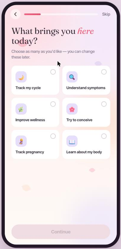
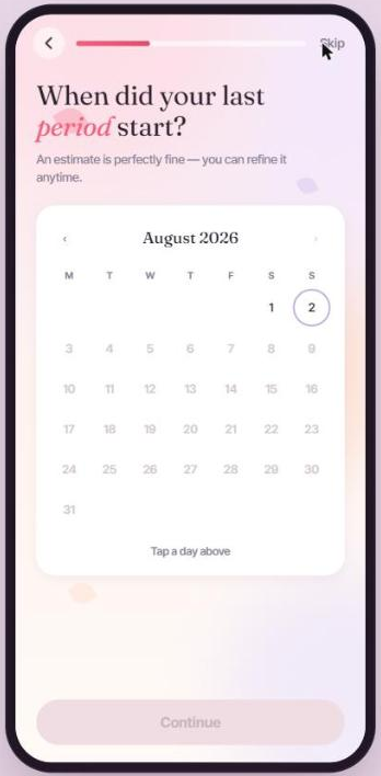
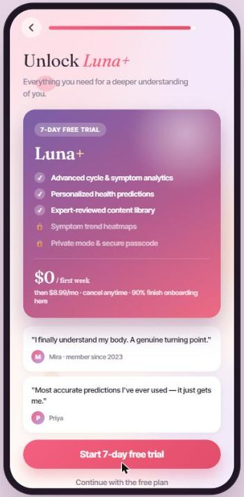
Luna is a period and wellness tracking app I designed: a calmer, warmer alternative to the clinical questionnaires most cycle-tracking apps open with. It walks through a 25-step onboarding flow that reads more like a conversation than a form, then hands off into a full app shell for daily cycle tracking, symptom logging, and insights.
Services:
Challenge:
Most period-tracking onboarding feels like a medical intake form: dozens of intimate questions asked back-to-back with no warmth or pacing. The goal was to make that same depth of personalization feel gentle instead of clinical.
Role:
Designed and built the entire flow solo: questionnaire architecture, screen-type variety (wheels, cards, calendars, dark check-ins), illustration and motion direction, and the full front-end implementation.
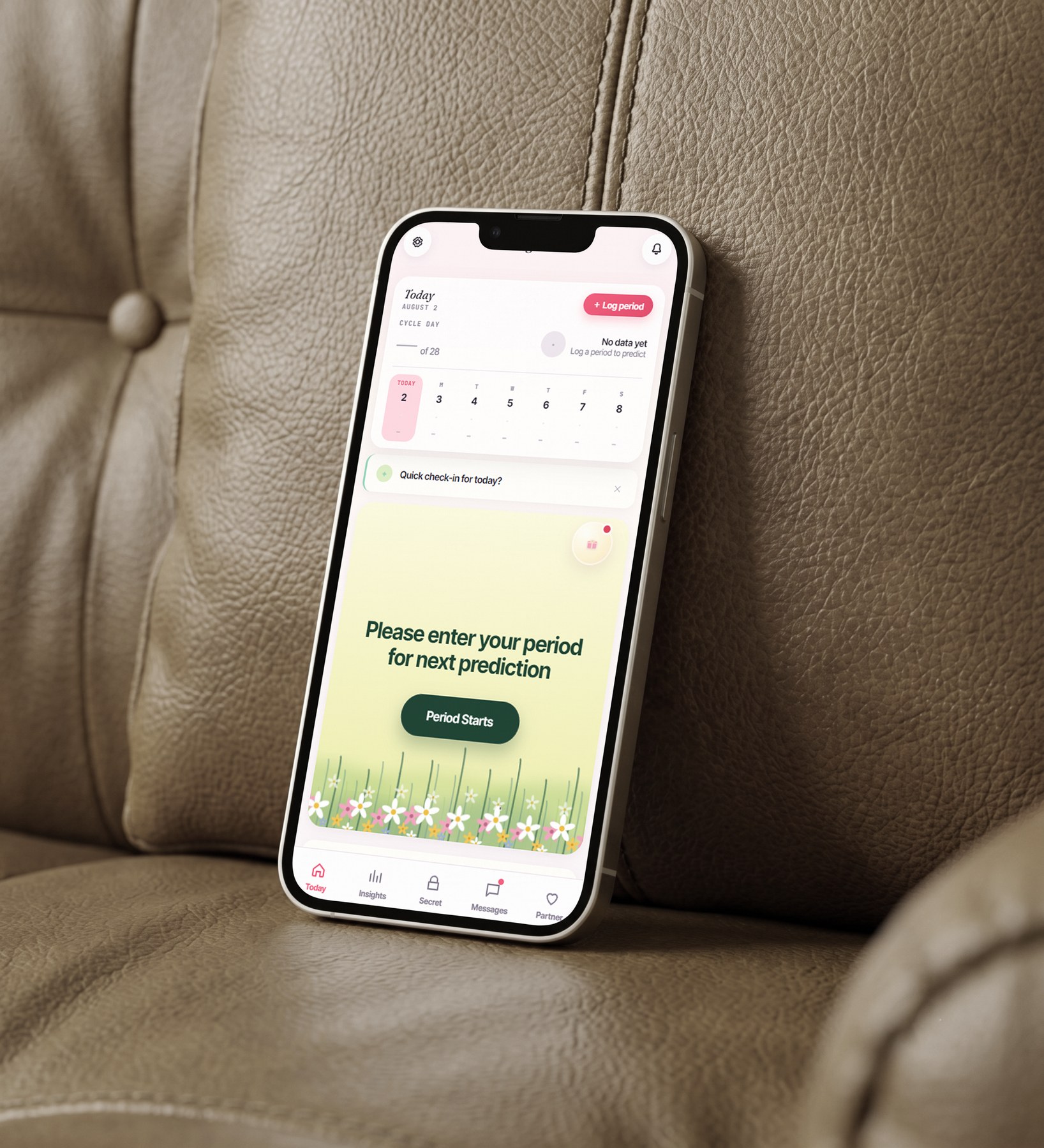 Luna
Luna
Most period-tracking apps open with a wall of clinical questions: dozens of intimate prompts fired at you before you've even seen what the app does. That upfront intensity is a big part of why onboarding completion (and trust) drops off so early.
Luna spreads that same depth of personalization across a 25-step flow that feels like a conversation: varied screen types, warmer copy, and pacing that never asks more than one thing at a time, so the app earns trust before it earns data.
By the Numbers
Wellness that feels like a deep breath.
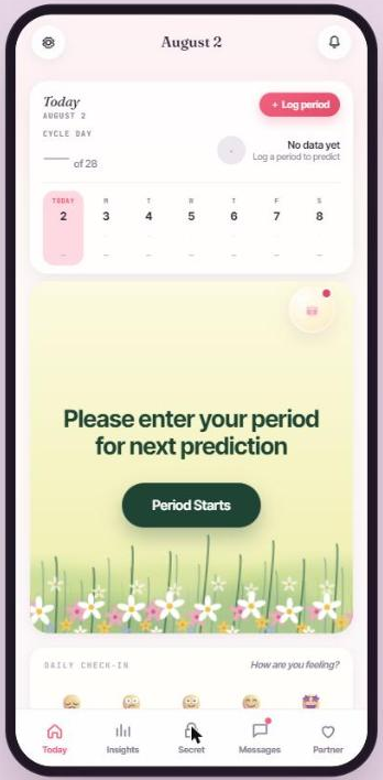
Status: In Development
Design and front-end build shipped from my end. The product is currently in development.
- Calming, conversational onboarding
- Cycle-phase-aware home dashboard
- Built entirely in vanilla HTML, CSS & JS
Product Screens
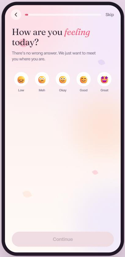
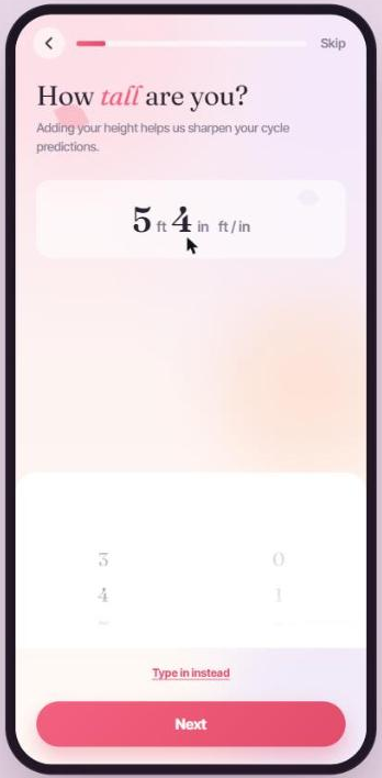
Outcome
Luna shipped as a fully built, functioning flow rather than a set of static screens: six distinct screen types (wheels, cards, calendars, dark check-ins) were built as a reusable pattern library instead of one-off screens, so new questions could be added without inventing new UI each time. Spacing personalization across a longer, warmer flow meant no single screen had to carry the full weight of feeling clinical. Onboarding also hands off cleanly into a working app shell, so the shift from answering questions to using the product happens in one continuous session, not a jarring cutover into a separate demo.
Key Takeaways
- Warmth is a pacing problem as much as a visual one - varying screen type and rhythm did more for how clinical the flow felt than any illustration choice.
- Building the front end myself changed how I designed: I stopped drawing screens I wasn't sure I could justify implementing well.
- A pattern library pays off fastest in onboarding, where the temptation to design "just one more custom screen" is constant.
- The best test of an onboarding flow is whether it earns the right to ask the next question - not whether any single screen looks good in isolation.
