 Projects / QueWorkspace
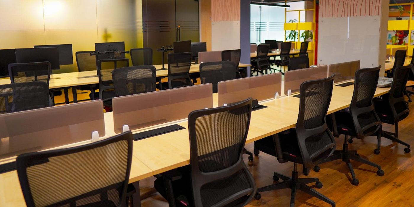
QueWorkspace is a coworking space I designed in JP Nagar 4th Phase, Bengaluru, and the platform that runs it. It covers the full loop: a marketing site that books tours and sells plans, a member dashboard for daily room bookings and billing, and an admin console the floor team runs the space from.
Services:
Challenge:
Coworking means designing for three very different people in one product: a visitor deciding whether to book a tour, a member booking a meeting room between calls, and a floor manager verifying a UPI payment by hand before allocating credits. Each needed its own clarity without becoming three disconnected tools.
Role:
Designed QueWorkspace end-to-end: the marketing site and booking funnel, the member dashboard for bookings, credits and billing, and the admin console for floor operations, iterating the dashboard through eight versions to get the daily-use flows right.
Running a coworking floor day-to-day meant juggling manual booking sign-ups, UPI payment verification, and member communication across spreadsheets and chat threads, with no single place for members to book a room or for the team to see what's happening on the floor right now.
QueWorkspace brings booking, billing, and floor operations into one platform: a marketing site that turns a tour into a plan, a member dashboard for day-to-day bookings and credits, and an admin console the floor team runs the space from.
By the Numbers
Where work truly flows.
Status: Shipped
Live: the real platform running the coworking floor day to day.
- Booking, billing & floor ops in one platform
- Member dashboard with live credits & invoices
- Admin console for daily floor operations
Explore the Product
Outcome
QueWorkspace is live, running a real coworking floor in Bengaluru day to day - not a concept, but the actual system the team uses to book rooms, verify payments, and manage the space. The admin console replaced a mix of spreadsheets and chat threads with one place to see what's happening on the floor right now. The member dashboard went through eight versions, each refined against how members actually book and pay in daily use rather than how the flow looked on paper. Three very different audiences - visitor, member, and floor manager - now share one consistent design system instead of three disconnected tools.
Key Takeaways
- Designing for a product you can watch people actually use is a different discipline than designing for a spec - the eight dashboard revisions came from real friction, not guesses.
- Three audiences sharing one system only works if their differences are handled in information architecture first, not patched in with UI later.
- Operational software earns trust through the boring parts - payment verification and credit accuracy mattered more to the floor team than any visual detail.
- Shipping something live changes how carefully you design for the edge case, because the edge case is a real person's Tuesday.
